The psychology of color in branding

Don’t take colors for granted. Color is one of the most important elements of marketing psychology and highly contributes to conversion rates on websites and in stores. Studies show that specific colors evoke specific emotions and put people in the right mindset to better reach to your call-to-actions. In other words, colors can help your brand speak. 

What's the meaning behind colors?

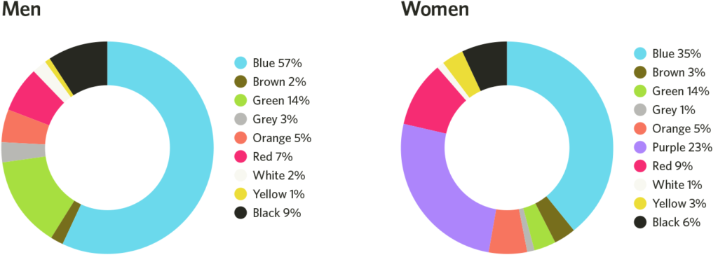
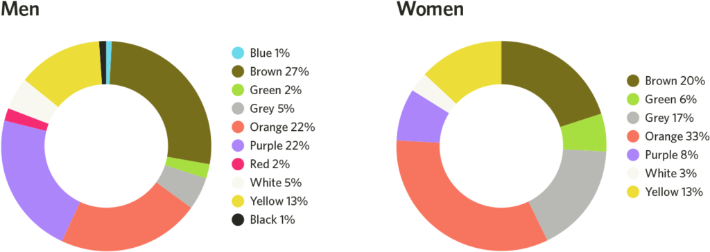
Each color has a soft underlying meaning behind it, and whether you are conscious of it or not, you perceive brands differently based on the colors they choose to display. See if the list below makes sense to you!

Red refers to excitement, bold and energy. It encourages impulsive behavior and creates a sense of urgency. It’s often used by fast-food chains as it also encourages appetite. It’s a color associated with movement and passion and physically stimulates your senses and your body. Blue is often associated with peace, reliability and trust. It provides a sense of security, calmness and tranquillity. That’s why it’s often used by family-oriented retail brands as well as offices and other workspaces. Green strongly refers to health, environment and nature. It stimulates harmony and encourages balance between body and emotions. Green can also be associated with money. Purple is color that refers to prestige, creativity and wisdom. It’s often used by the creative industry (including Sprkle!) and conveys the idea of imagination and quality. Yellow and orange increase cheerfulness and optimism – they are bright and happy colors. They are colors that draw attention and are therefore often used by retailers. They promote enthusiasm and stimulate the logic center of the brain. Black is associated with power and stability. Often used by electronics manufacturers, it’s a symbol of strength and intelligence. It’s a classy color that can be overwhelming if used too frequently. White refers to purity and safety. It’s a color that also refers to creativity as the absence of color. White conveys the sense of calmness and neutrality.

Gender preferences

Not surprisingly, men and women have different preferences when it comes to colors and how they perceive them. Joe Hallock’s study on this topic, called Colour Assignments shows clear preferences in certain colors across gender. It’s important to note that cultural background and environment play an important role in they way people perceive colors – but here below are Hallock’s findings:

Men and women’s favorite colors

Men and women’s least favorite colors

Additional research shows that men prefer bold colors while women prefer softer colors. This is very valuable information to keep in mind when choosing colors for your brand. What’s your target audience? How will you best engage them?

What does data say?

Numbers really speak for themselves in this case. Over 85% of consumers place color as a primary reason for why they buy a particular product. The right use of colors also increases brand recognition by 80% – which directly links to consumer confidence. Similarly, 52% of consumers claim they won’t return to a store if they dislike the aesthetics of it. 

Separate studies were able to define what customers base their decision-making process on. 1% decide based on smell/sound, 3% decide based on texture, while 93% decide based on visual appearance. 

Bottom line

Carefully handpick the colors that you will carry on your flag. Your brand needs a voice and it needs to sound appealing to your audience. It is very likely they will judge you based on how you look and what your colors mean to them.

Don’t stop exploring! 🙂
For more super cool content, check us out on Facebook and Instagram. Any project in mind you’d like to discuss with us? We’re always available at hello@sprklestudios.comlet’s create something together!